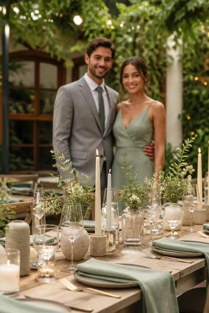
1. Smoked Rose + Oat Linen + Antique Brass
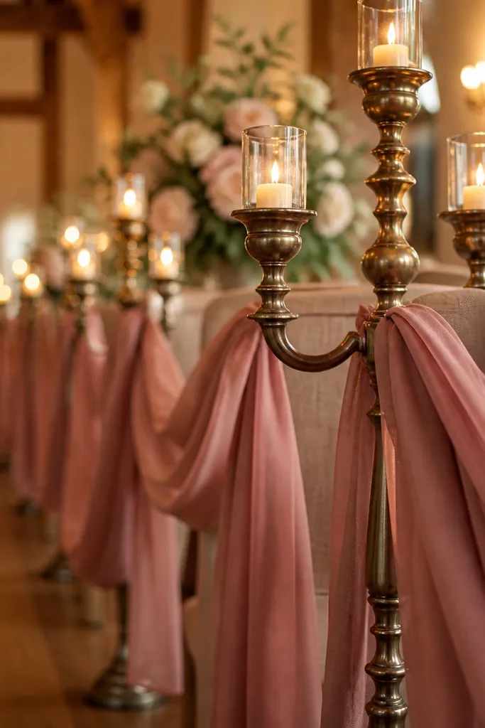
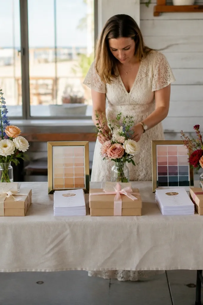
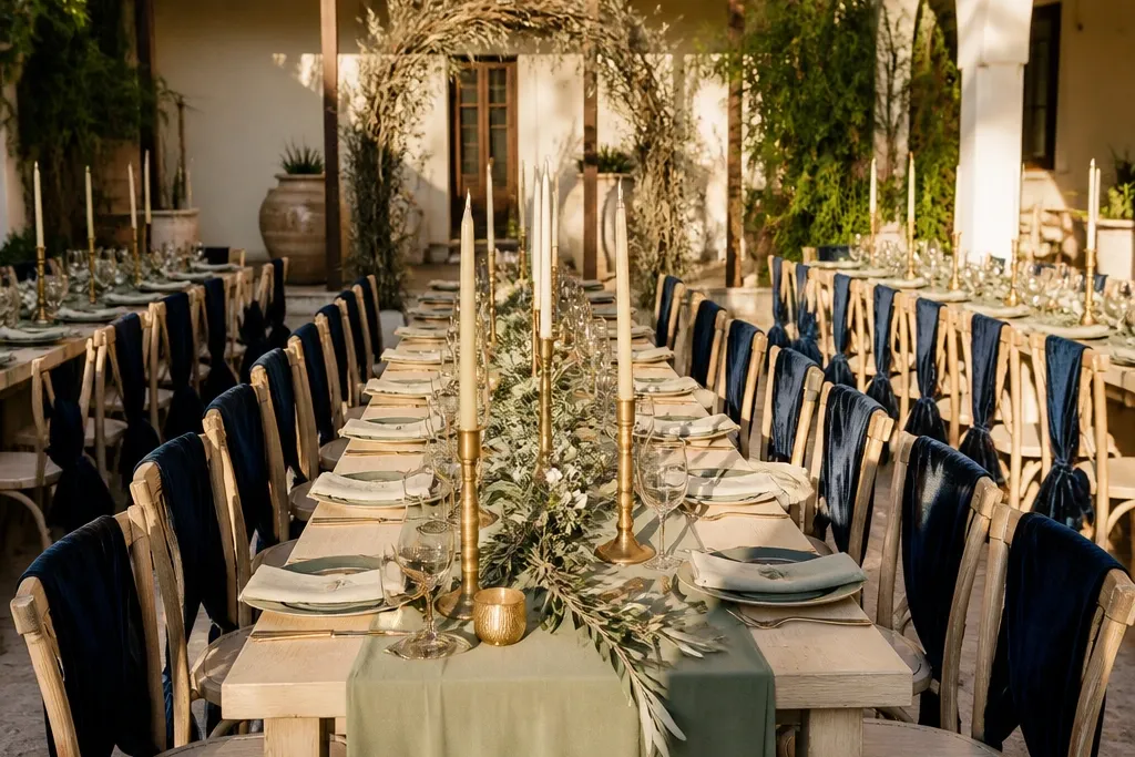
Smoked rose provides an understated, sophisticated floral flush that steers completely clear of sugary bubblegum pink. Oat linen introduces grounded organic texture that diffuses bright sunlight, while antique brass adds an heirloom metallic glint that glows warmly as natural light fades into evening.
Drape dining tables in heavy, unironed oat-toned Belgian linen cloths. Cluster compotes filled with smoked rose garden roses, cafe au lait dahlias, and silver dollar eucalyptus along the center. Flank floral clusters with brushed antique brass taper holders holding 10-inch beeswax candles, paired with deckle-edged oatmeal paper menus calligraphed in warm sepia ink.
Request that your florist selects roses leaning toward dusty mauve or taupe undertones to ensure petals don’t read neon under camera flash.
Avoid pairing smoked rose with polished high-shine brass or bright chrome, which produces distracting specular glare.
2. Deep Emerald + Cream + Blackened Steel
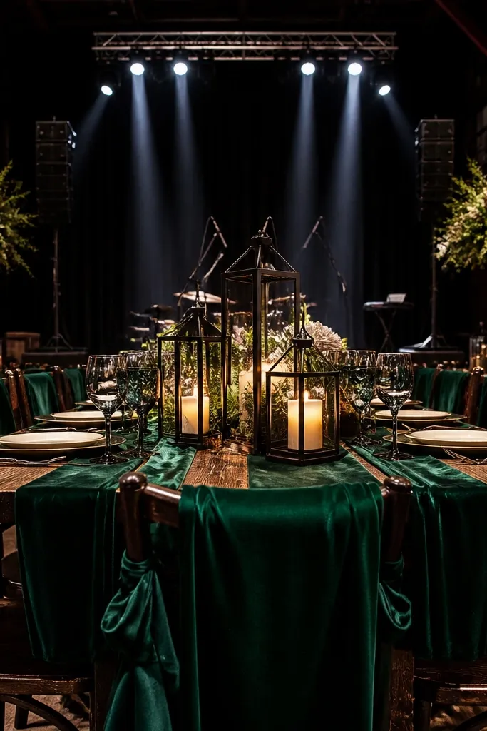
A commanding, high-contrast palette that feels contemporary and regal. Deep emerald injects dramatic botanical saturation, creamy white floral blooms prevent the setup from feeling shadowy, and blackened steel hardware provides clean architectural lines that anchor wide reception shots.
Outfit banquet tables in floor-length matte emerald twill or textured linen. Stack matte black ceramic dinner plates topped with folded cream linen napkins and blackened steel flatware. Erect low centerpieces featuring cream gardenias, ivory ranunculus, and trailing dark Italian ruscus interspersed with matte black iron candelabras.
Use low-voltage warm candlelight (2700K) to keep the deep emerald fabric from appearing muddy or black in dim evening reception rooms.
Do not add bright turquoise or mint green accessories, which dilute the majestic jewel-tone contrast.
3. Cocoa Brown + Warm Ivory + Burnt Orange
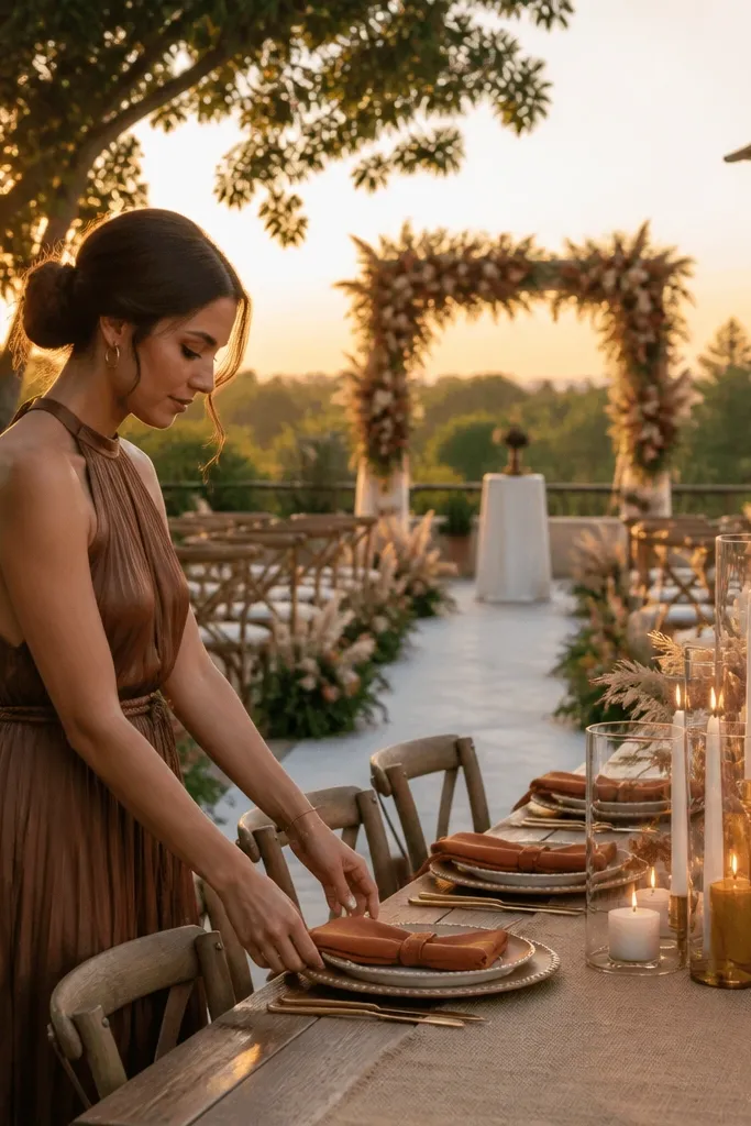
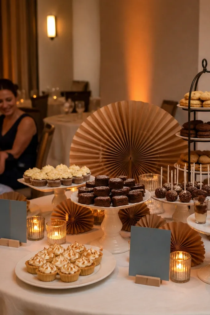
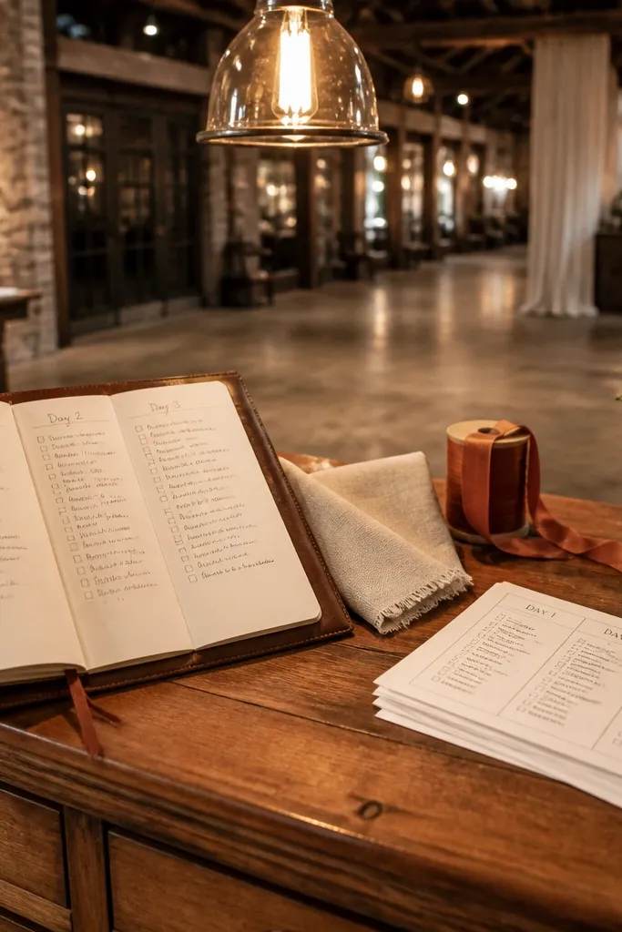
Set warm ivory raw-silk runners across dark cocoa stained harvest tables. Build centerpieces around terracotta and amber glass compotes filled with burnt orange ranunculus, toffee roses, dried wheat, and rust-toned amaranthus. Accent each setting with cocoa velvet ribbon tied around ivory menu cards and warm amber water goblets.
Warm, earthy, and rich with harvest romance. Cocoa brown serves as an executive neutral that feels softer than black, warm ivory floods the frame with soft skin-flattering light, and burnt orange provides a fiery sunset focal point that photographs brilliantly during golden hour.
Skip thisAvoid pairing cocoa brown with cool gray or optic white, which makes the warm earth tones look dirty.
Quick tipAudit your cocoa brown fabric under direct daylight before finalizing rentals, ensuring it carries warm chocolate rather than cool charcoal undertones.
4. Lavender Smoke + Pearl White + Soft Pewter
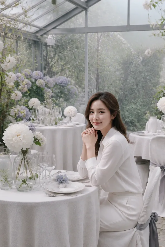
Cover guest tables in pearl white slubbed linen cloths that touch the floor. Layer delicate lavender smoke washed cotton napkins across matte stoneware chargers. Decorate with antique pewter compote vessels holding lavender sweet peas, white astilbe, and silvery dusty miller, surrounded by pewter julep cups with flickering tea lights.
An ethereal, mist-inspired palette tailored for romantic twilight ceremonies and historic stone estates. Lavender smoke delivers muted pastel intrigue without feeling juvenile, pearl white reflects clean natural illumination, and soft brushed pewter adds aged sophistication.
Skip thisSkip bright violet or electric purple flowers, which overpower the delicate, smoky mood of this subtle palette.
Quick tipPair this palette with outdoor golden-hour portrait sessions so the low sun highlights the soft lavender haze in chiffon dresses and floral petals.
5. Powder Blue + Sandstone + Brushed Gold
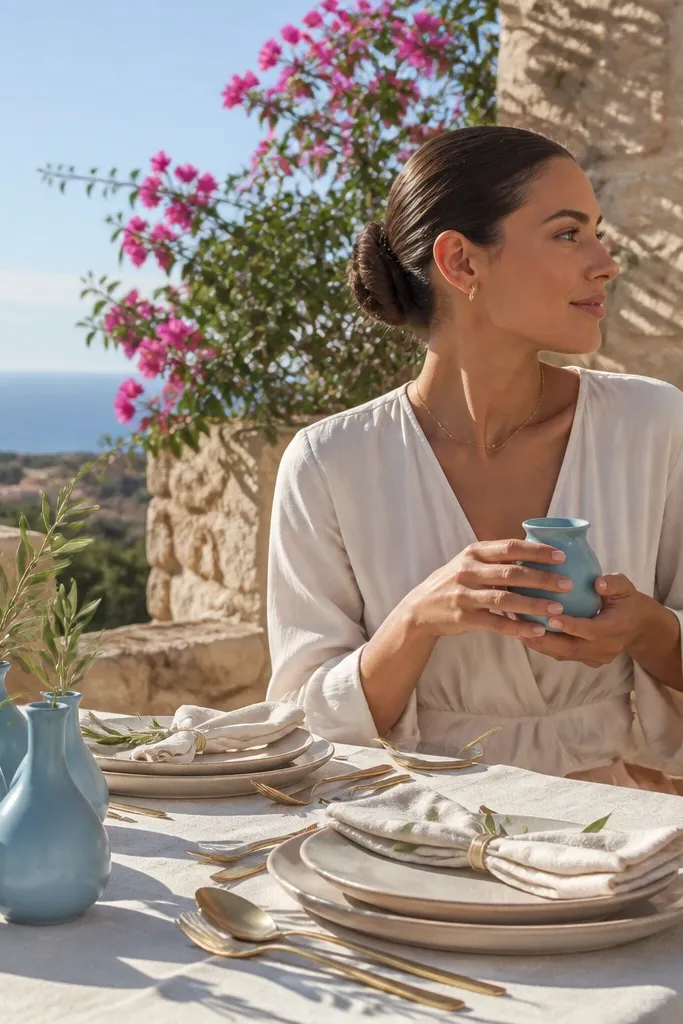
A sun-drenched European coastal aesthetic that feels timeless and breezy. Powder blue introduces refreshing sky tones, warm sandstone ceramic textures keep the palette grounded and warm, and brushed gold catches afternoon terrace sunshine with effortless poise.
Lay sheer powder blue crinkled chiffon runners over sandstone-colored linen tablecloths. Position custom sandstone ceramic chargers flanked by brushed gold cutlery and pale blue fluted wine glasses. Arrange airy centerpieces featuring white delphinium, powder blue hydrangeas, and trailing olive foliage in low sandstone pottery.
Ensure your powder blue textiles carry a gentle gray-lavender undertone rather than an icy neon hue for editorial elegance.
Avoid adding cool chrome or polished silver flatware, which cools down the sunbaked warmth of sandstone.
6. Modern Black + Cream + Electric Lime Botanical Pop
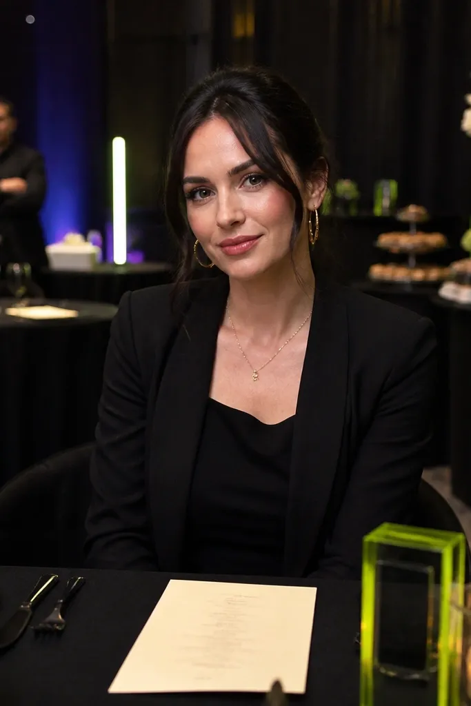
Dress long banquet tables in matte black linen twill. Set out crisp cream bone china plates paired with black matte flatware and cream linen napkins. Intersperse sculptural single-stem arrangements of electric lime green cymbidium orchids, chartreuse bells of Ireland, and monstera leaves in slim matte black ceramic vases.
High-fashion urban minimalism with an energetic botanical twist. Jet black creates razor-sharp silhouette contrast, creamy white provides soft bridal elegance, and targeted pops of electric lime green foliage or orchids inject modern avant-garde excitement.
Skip thisNever use artificial lime green dyed paper or synthetic polyester ribbons, which photograph harshly under flash.
Quick tipRestrict electric lime strictly to natural botanicals and ribbon accents so the color reads intentional rather than neon.
7. Terracotta Dust + Sage Green + Antique White
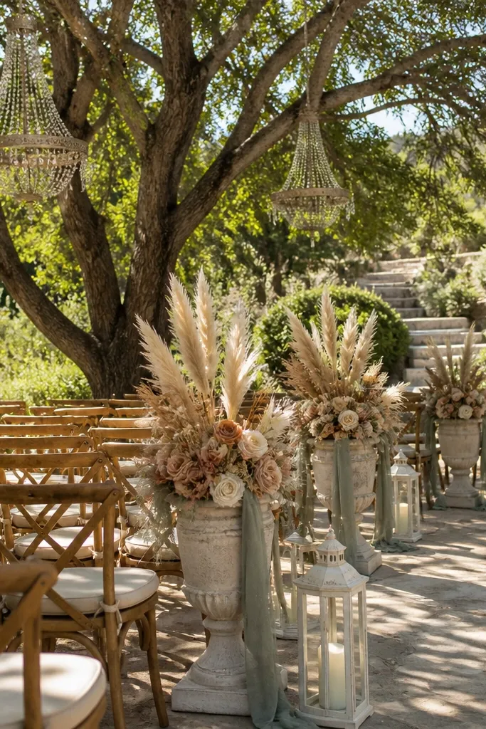
Roll unlined terracotta-toned linen runners down raw wood dining tables. Line center tables with dense runners of fresh sage foliage, silver dollar eucalyptus, and antique white garden roses. Nestle raw terracotta flowerpots holding herbs and white beeswax pillar candles along the tablescape.
Organic, warm, and rooted in the Mediterranean landscape. Terracotta dust brings tactile clay warmth, silvery sage green supplies botanical freshness, and antique white acts as a luminous canvas that keeps outdoor garden tables feeling airy.
Skip thisAvoid adding bright tomato red or candy orange blooms that clash with the muted mineral dust of terracotta.
Quick tipUse unglazed terracotta tableware to introduce matte earthy texture that absorbs harsh noon sun reflections.
8. Navy Ink + Porcelain Pink + Spun Copper
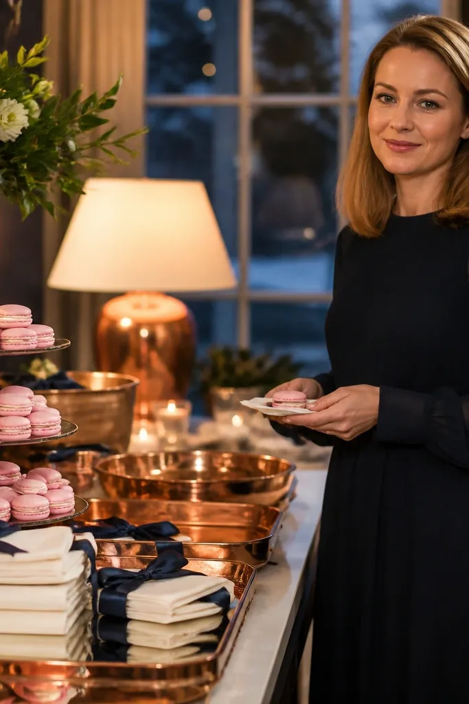
Classic black-tie luxury redefined with contemporary warmth. Navy ink delivers formal architectural depth, porcelain pink softens the atmosphere with gentle bridal romance, and spun copper introduces an unexpected, radiant metallic gleam.
Set tables with heavy navy ink linen tablecloths. Layer porcelain pink stoneware plates topped with copper-foiled menu cards and polished copper flatware. Style centerpieces with porcelain pink dahlias, quicksand roses, and dark navy privet berries in spun copper bowls.
Keep the pink strictly within a muted, porcelain undertone so it registers softly against deep navy under indoor flash photography.
Avoid bright magenta or hot fuchsia napkins that disrupt the regal composure of navy ink.
9. Forest Green + Ivory + Deep Teal Watercolor Florals
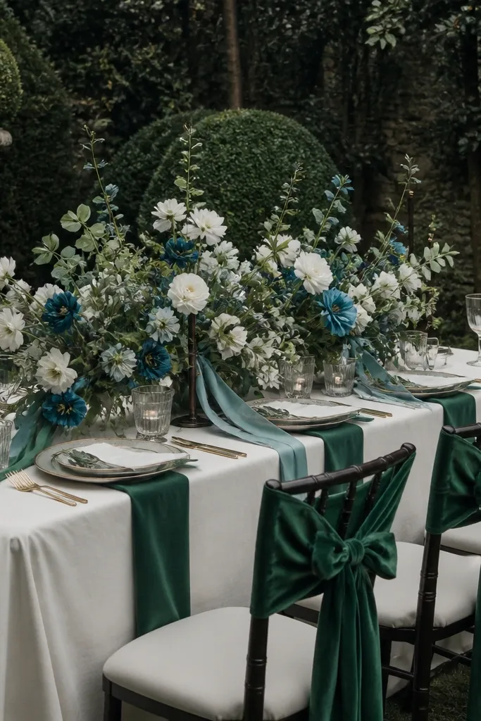
Suspend forest green drapery behind the head table. Cover guest tables with ivory Belgian linen cloths. Feature flowing centerpiece arrangements composed of deep teal-sprayed eucalyptus, white anemones with dark centers, ivory peonies, and dark forest foliage in brushed brass urns.
Moody, painterly, and deeply botanical. Deep forest green sets an organic canopy foundation, ivory floods the eye with brightness, and deep teal accents introduce rich watercolor gradation that gives floral arrangements breathtaking photographic depth.
Skip thisDo not mix light lime green or sunny yellow into this concept; keep foliage strictly in the deep emerald, forest, and teal spectrum.
Quick tipIncorporate watercolor-wash stationery combining forest green and deep teal ink to tie the paper suite directly to your floral palette.
10. Blush Sand + Charcoal + Soft Gold Highlights
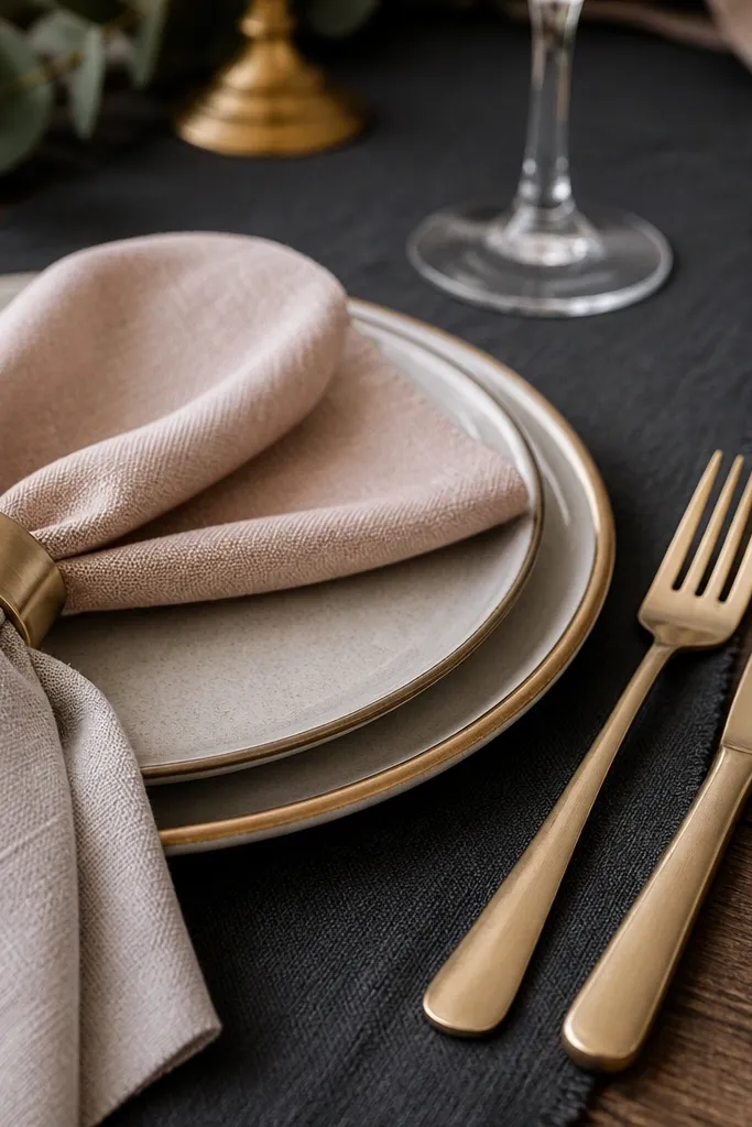
An ultra-chic metropolitan neutral palette that flatters every skin tone. Blush sand bridges the gap between beige and soft rose, deep charcoal gray provides structured contrast, and soft gold highlights cast an editorial glow across table settings.
Anchor tablescapes with charcoal gray linen tablecloths. Fold blush sand linen napkins over charcoal ceramic dinner plates, accented with matte brushed gold cutlery. Centerpieces showcase blush sand quicksand roses, dried pampas plumes, and bleached ruscus in low charcoal compotes.
Verify that your blush sand textiles read warm in natural daylight rather than cool gray before ordering wedding party dresses.
Skip stark bright white napkins; charcoal and blush sand require soft creamy transitions to maintain their editorial depth.
11. Pearl Gray + Pure White + Smoke Blue Ribbon Details
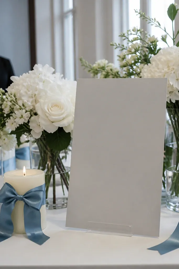
Crisp, airy, and quietly aristocratic. Pearl gray provides a soothing, low-contrast neutral foundation that lets pure white florals shine, while smoke blue velvet or silk ribbon details introduce a whisper of coastal morning mist.
Drape dining tables in floor-length pearl gray washed linen. Set out classic white porcelain plates with silver-rimmed glassware and white cloth napkins tied with frayed-edge smoke blue silk ribbons. Arrange all-white floral centerpieces of white reflexed tulips, ranunculus, and sweet peas in clear glass cylinders.
Choose trailing silk ribbons in smoke blue that flutter naturally in the breeze for dynamic motion in ceremony photos.
Avoid pairing smoke blue with bright royal blue or navy items, which visually overpower the gentle pearl gray foundation.
12. Warm Ivory + Caramel + Deep Burgundy Wine Tones
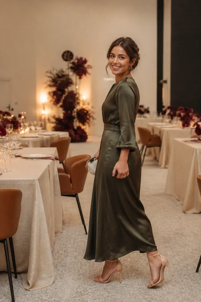
Decadent, cozy, and deeply romantic for autumn and winter celebrations. Warm ivory keeps the venue luminous, caramel brings sun-ripened warmth and leather-like luxury, and deep burgundy wine tones provide rich, camera-grabbing focal points.
Dress banquet tables in warm ivory floor-length cloths crowned with a caramel raw silk runner. Arrange lush centerpieces featuring burgundy dahlias, black baccara roses, caramel carnations, and dark chocolate cosmos. Complete the look with amber glassware, caramel taper candles, and gold flatware.
Select deep burgundy blooms that lean toward rich plum and wine rather than bright red to maintain an upscale, moody mood.
Avoid bright holiday-red accents or green pine needles that unintentionally shift this aesthetic toward Christmas decor.
13. Coral Rose + Sea Glass Teal + Whitewashed Wood
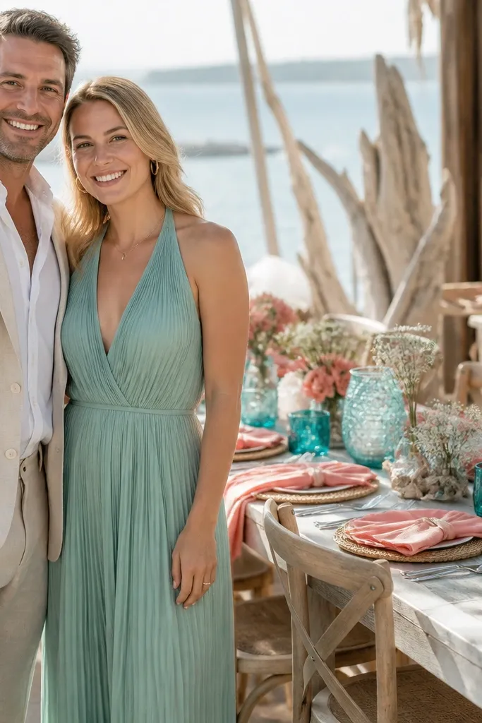
A vibrant, sunlit coastal aesthetic that feels sophisticated rather than tropical. Soft coral rose provides warm floral radiance, sea glass teal captures ocean light with translucent charm, and whitewashed wood supplies breezy, weathered coastal texture.
Expose whitewashed wooden harvest tables for an airy, informal feel. Drape sea glass teal gauze runners down the center, adorned with compotes holding coral rose garden roses, peach ranunculus, and white sweet peas. Place sea glass frosted votives and coral-bordered calligraphy place cards at each seat.
Keep coral tones muted with a dusty rose undertone so blooms photograph softly in direct midday beach sunlight.
Do not use neon orange or bright plastic turquoise accents, which cheapen the relaxed coastal elegance.
14. Pale Pistachio + Soft Cream + Toasted Wheat Gold
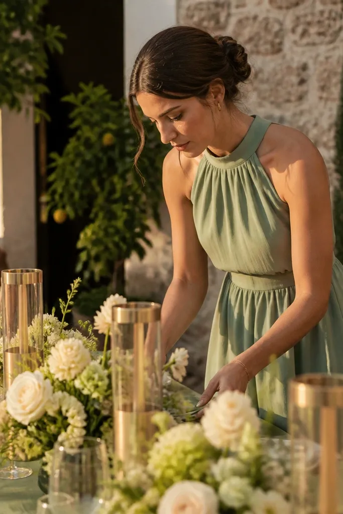
Cover guest tables in soft cream cotton-linen cloths accented with pale pistachio linen runners. Arrange centerpieces featuring soft cream peonies, white lilac, pale pistachio foliage, and dried toasted wheat stems in brushed gold footed compotes. Set the table with gold-rimmed plates and amber water tumblers.
Fresh, restorative, and celebrating spring awakening. Pale pistachio delivers an unexpected botanical neutral, soft cream keeps the lighting bright and bridal, and toasted wheat gold accents introduce the warmth of late afternoon sunshine across table settings.
Skip thisSkip bright lime green or chartreuse accents, which fight the serene, herbal quality of pale pistachio.
Quick tipIncorporate natural dried grasses like toasted wheat and bunny tails alongside fresh spring blooms for rich textural contrast.
15. Sapphire Night + Porcelain White + Silver Leaf Accents
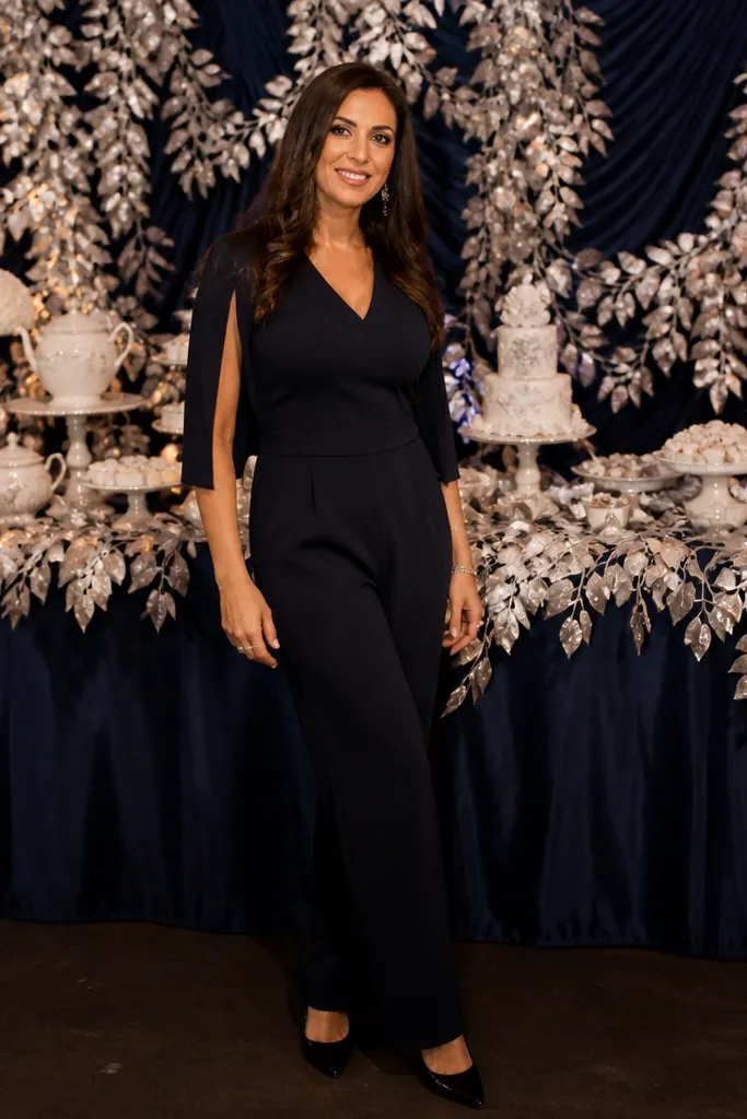
Nocturnal, regal, and breathtaking for formal evening galas. Sapphire night supplies saturated, jewel-toned drama, porcelain white ensures crisp contrast around seated guests, and silver leaf stationery reflects dancing candlelight across the ballroom.
Dress reception dining tables in porcelain white heavyweight twill. Anchor the table with sapphire night velvet runners and napkins. Cluster towering crystal vases filled with white calla lilies and deep sapphire delphiniums down the center, accompanied by silver-leaf rimmed menu cards and polished silver candelabras.
Use warm white candlelight to counterbalance the cool temperature of sapphire and silver, keeping guest portraits flattering.
Avoid pairing sapphire night with warm yellow brass; cool silver, chrome, or platinum provides the proper regal harmony.