
1. Dusty Rose, Sage Green & Antique Gold
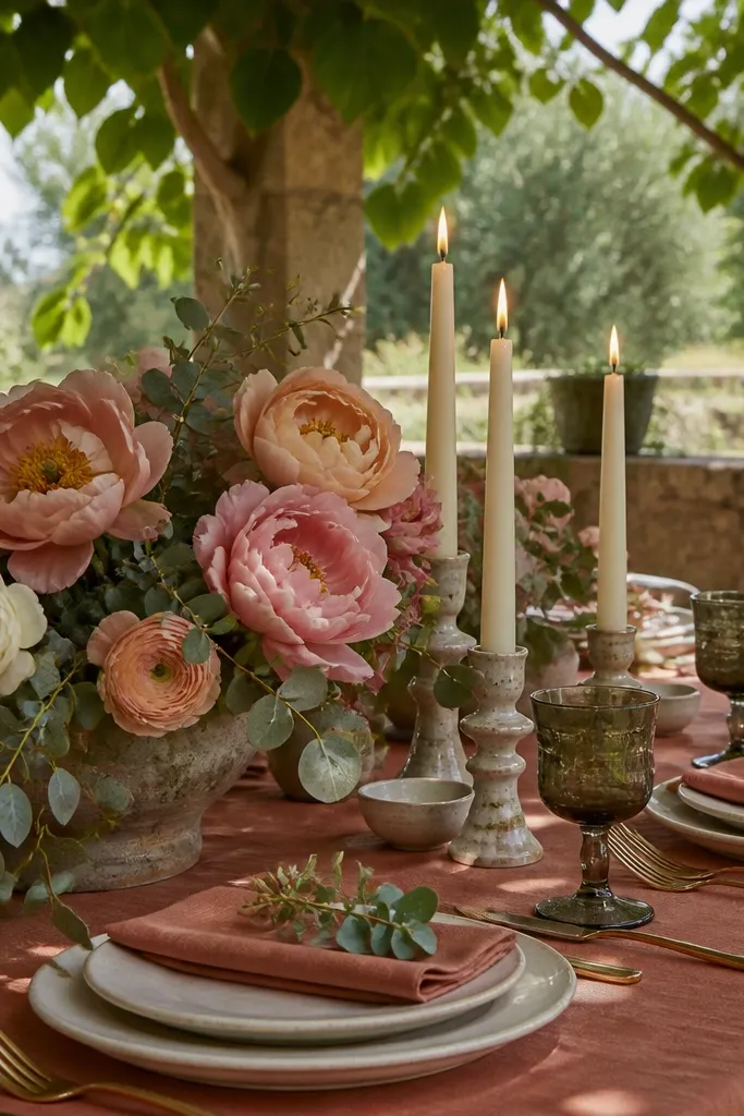
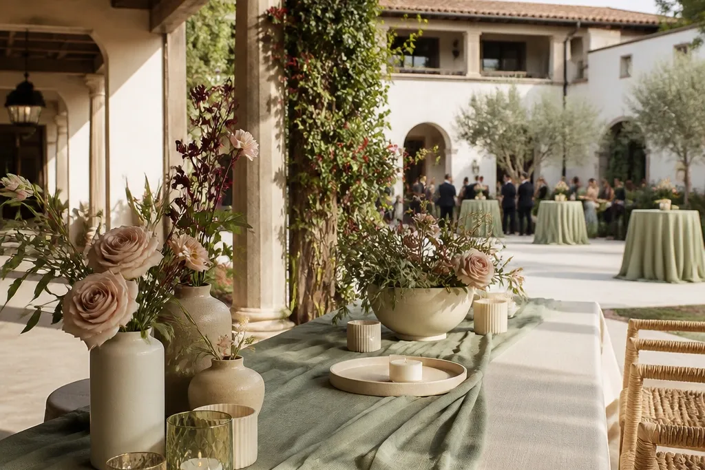
Dusty rose brings an understated, romantic flush that keeps sage green from feeling overly medicinal, while antique gold injects historic grandeur. Under natural afternoon sun, this palette catches gentle highlights without blowing out white balance on camera. It excels from late May through early September in al fresco courtyards, historic stone villas, and open-air rose gardens.
Start by laying an unironed, heavy sage green linen runner across washed stone tables. Then layer cluster arrangements of quicksand roses, blushing bride protea, and silver dollar eucalyptus punctuated by antique gold taper holders. Finally, use low 4-inch cream beeswax candles to cast an amber rim light across the glassware right as dusk falls.
Quick tipKeep the dusty rose leaning toward mauve rather than pastel bubblegum pink to ensure it reads sophisticated in direct sunlight.
Skip thisAvoid high-shine brass holders; their reflective glare produces distracting specular hot spots in evening photography.
2. Terracotta, Desert Sand & Pampas White
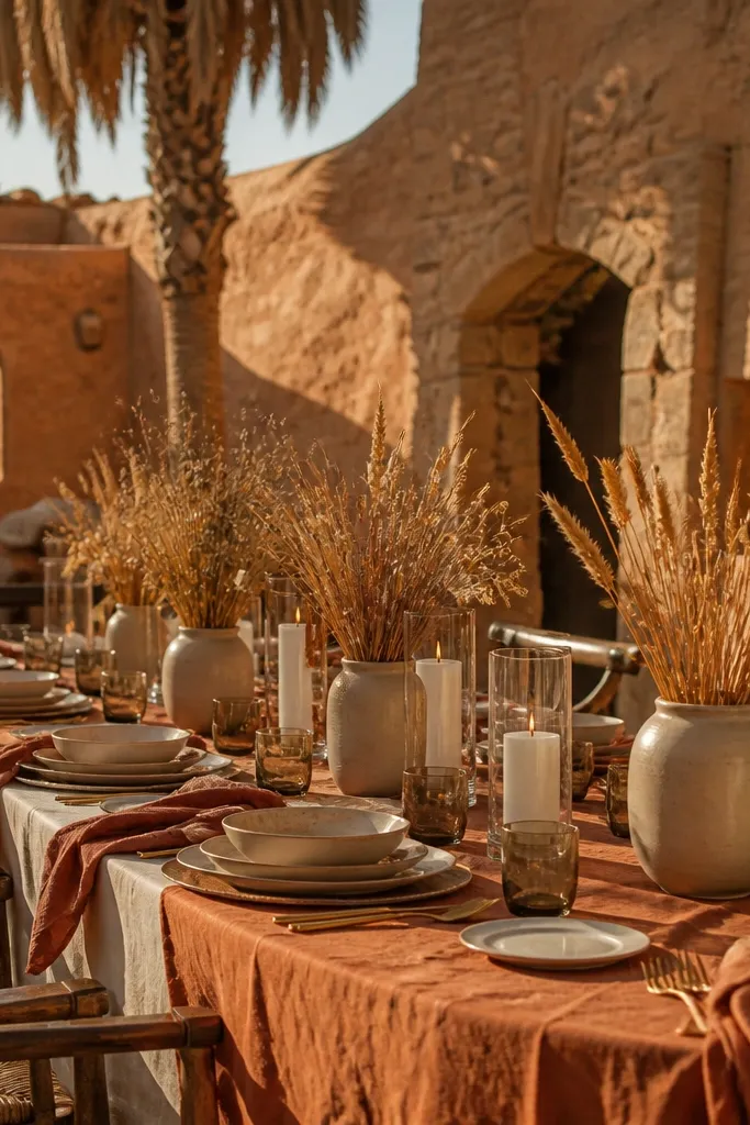
A dry, architectural palette anchored in mineral richness. Terracotta supplies grounding warmth, sand keeps the expanse airy, and pampas white provides textural volume without adding stark contrast. This color combination photographs exceptionally well in arid climates, dry plains, and canyon venues from August through October when the horizon turns honeyed.
Start by establishing a base of neutral sand-hued jute runners or exposed sand-washed wood. Then cluster sculptural terracotta vessels filled with dried seed pods, lunaria, and sand-toned quicksand carnations. Finally, balance the low earth tones with hanging bleached grass clouds positioned where the sunset shines directly through their edges.
Quick tipUse matte terracotta vessels instead of glazed earthenware so the pottery absorbs daylight rather than producing reflective glare.
Skip thisSkip adding stark white polyester linens; the contrast between bright cool white and sunbaked terracotta breaks the organic aesthetic.
3. Midnight Navy, Crisp Ivory & Polished Champagne
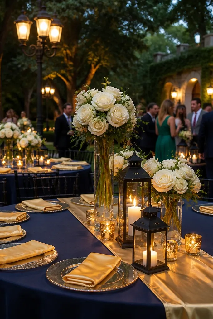
This combination takes the timeless black-tie aesthetic and adds depth. Midnight navy provides a deep, dramatic canvas that allows crisp ivory florals to jump forward in flash photography, while champagne metallic accents bridge the gap between cool shadows and indoor venue chandeliers. Ideal for black-tie November through February weddings hosted in grand ballrooms or metropolitan clubs.
Start by dressing round tables in floor-length, heavyweight midnight navy twill that hangs straight with zero sheen. Then erect tall, architectural centerpieces featuring long-stem ivory calla lilies and white gardenias in polished champagne compotes. Finally, set out ivory menu cards embossed with champagne foil to reflect candle flickers directly into seated guest portraits.
Select midnight navy rather than royal blue; royal blue fluoresces under modern LED reception lighting and distorts skin tones on camera.
Avoid bright cobalt napkins or colored uplighting that turn midnight navy into an electric, oversaturated mess.
4. Olive Green, Warm Cream & Raw Oak
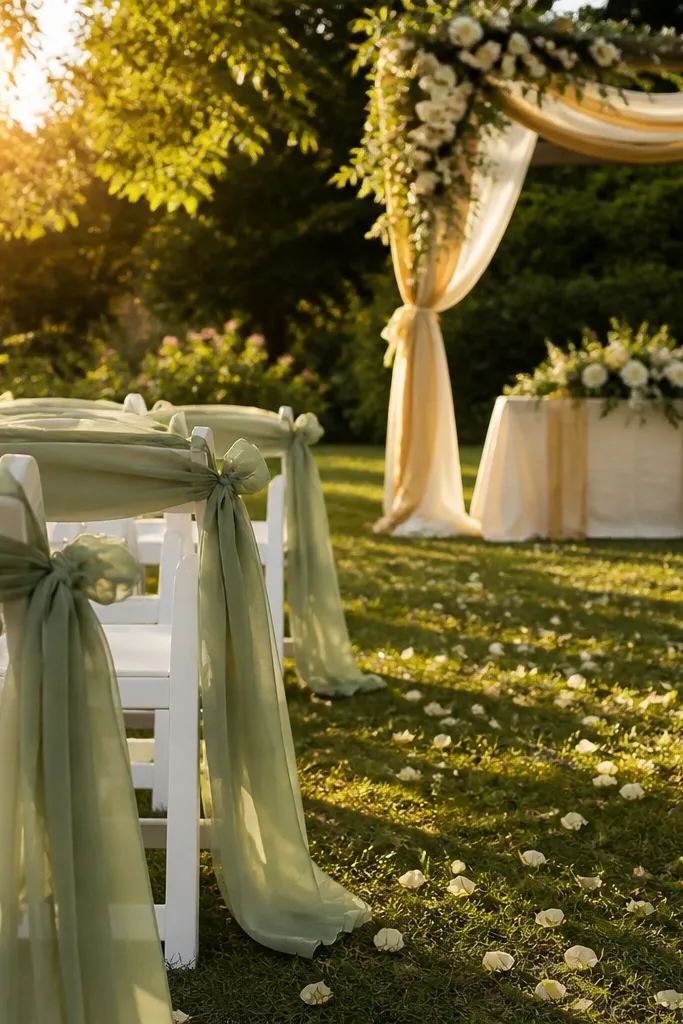
An effortless, botanical palette celebrating natural agriculture. Olive green anchors the leafy textures, warm cream creates clean negative space that lets vineyard rows shine, and raw oak introduces tactile warmth. This is the definitive summer-into-autumn vineyard palette, thriving between July and October when outdoor vines are dense and fruit-laden.
Start by leaving the raw oak farmhouse tables exposed to show their natural grain and knots. Then drape an asymmetrical, raw-edged warm cream linen runner loosely down the center, threading freshly cut olive branches and garden roses along its spine. Finally, intersperse ribbed amber tumblers and warm cream ceramic dinnerware to keep the tabletop looking organic and tactile.
Quick tipSelect real olive foliage with silvery undersides so that passing breezes introduce natural tonal movement in wide-angle photos.
Skip thisSkip dark green satin ribbons or forest green candles that clash with the silvery, gray-tinted foliage of natural olive leaves.
5. Emerald Green, Black Velvet & Brushed Brass
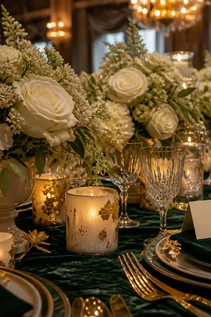
High-contrast, theatrical, and unapologetically rich. Emerald green provides lush saturation, matte black grounds the silhouette, and brushed brass introduces warmth against chilly winter twilight. Perfect for December through February estate weddings, conservatory greenhouses after dark, or historic library venues.
Start by deploying custom floor-length emerald green pressed velvet cloths across banquet tables. Then stack black matte stoneware plates flanked by brushed brass flatware, topped with dark forest foliage and black velvet ribbon ties. Finally, light black dripless taper candles placed inside varied-height brass candlesticks at 6-inch intervals down the table length.
Quick tipKeep overhead ambient room lights dimmed low; let the warm yellow flames of taper candles generate highlights on the emerald velvet.
Skip thisDo not introduce white flowers into this look; stark white reads as an aggressive, distracting beacon amidst deep jewel tones.
6. French Powder Blue, Warm Linen & Slate Gray
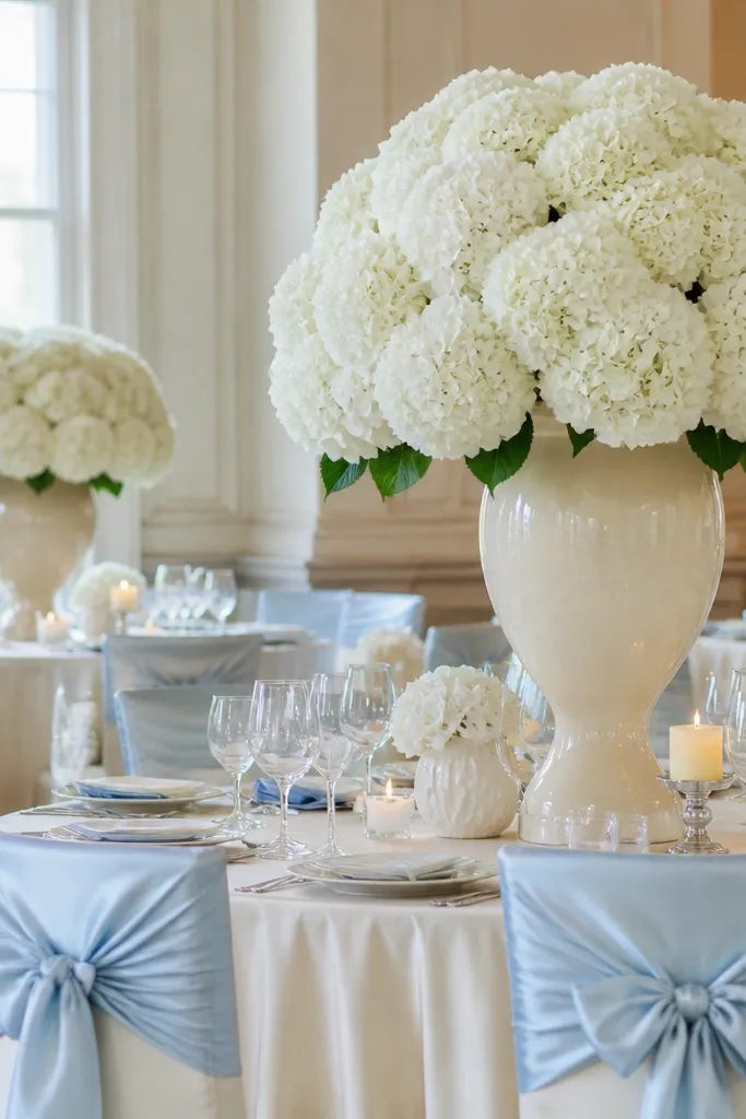
Delicate without turning sugary. French powder blue mimics coastal morning sea mist, warm linen prevents the blue from reading icy, and slate gray provides modern structural definition. This palette shines brightest between April and July for seaside cliffs, French country estates, and lakefront verandas.
Start by dressing tables in heavy, oatmeal-toned washed Belgian linen cloths that brush the stone patio floor. Then incorporate powder blue through delicate batiste cotton napkins and pale delphinium sprigs nestled alongside white ranunculus. Finally, anchor every place setting with matte slate gray chargers and slate-toned calligraphy place cards.
Ensure your blue carries a subtle grey-lavender undertone rather than a bright turquoise tint for classic editorial appeal.
Avoid shiny baby-blue organza or polyester satin that reflects harsh, artificial highlights in natural outdoor light.
7. Cinnamon, Burnished Bronze & Ochre
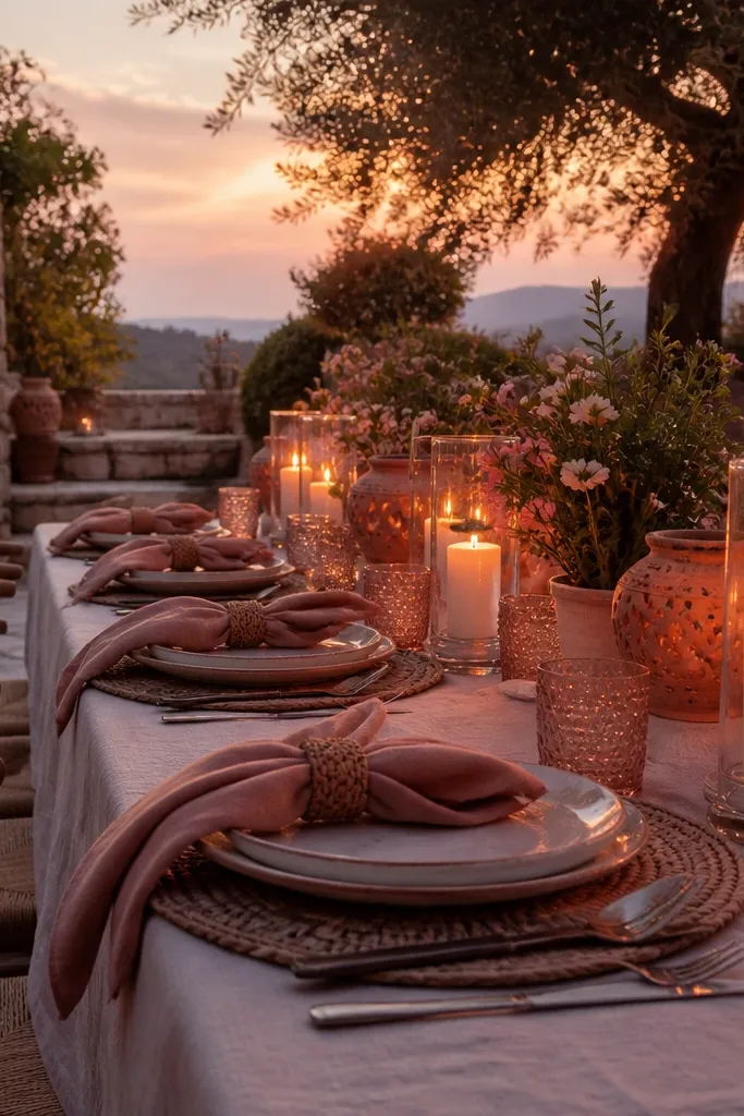
A masterclass in autumnal warmth. Cinnamon provides an earthy red-brown anchor, ochre injects rich golden-hour energy, and burnished bronze reflects the low harvest sun. This palette belongs in October and November when leaves are changing and afternoon ceremony light turns distinctly amber.
Start by placing a cinnamon-dyed raw silk runner along the center of dark wood tables. Then arrange compotes filled with ochre chrysanthemums, dried bracken fern, and toffee roses in burnished bronze urns. Finally, place personalized camel nubuck leather favor tags tied with bronze cord atop each guest’s napkin.
Mix fresh blooms with dried, textural grasses to capture varying degrees of fall foliage translucency on camera.
Avoid neon orange pumpkins or plastic foliage; real botanical tones rely on muted, desiccated rust and wood tints.
8. Lavender Mist, Muted Mauve & Frosted Silver
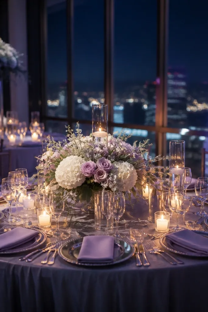
An ethereal, air-infused palette designed around dusk. Lavender mist softens the transition from blue daylight to evening shadows, muted mauve lends depth to floral installations, and frosted silver mirrors twilight reflections. Perfect for late March through June garden weddings timed for golden hour into dusk.
Start by framing your ceremony space with sheer, billowy lavender mist chiffon that catches natural wind movement. Then cluster arrangements of sweet peas, lavender, and muted mauve roses trailing down ceremony chairs. Finally, set frosted silver lanterns with flickering pillar candles around the perimeter to catch twilight ambient light.
Quick tipUse matte, frosted silver instead of polished chrome to keep the metallic sheen soft and painterly on camera.
Skip thisDo not pair this palette with bright yellow gold; cool lavender mist and warm yellow gold compete visually, creating muddy tones on camera.
9. Deep Plum, Fig & Dusty Blush
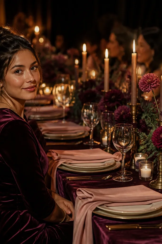
Rich, fruit-forward, and sophisticated. Deep plum provides the moody backbone, dark fig tones add textural luxury, and dusty blush injects feminine lightness that prevents the setup from looking dark or heavy. Unbeatable for September, October, and November barn or estate weddings.
Start by covering long farm tables in custom floor-length deep plum linen. Then line the center with low arrangements of dusty blush dahlias, dark purple scabiosa, and trailing dark foliage. Finally, accent each setting with handmade deckle-edged dusty blush cotton paper stamped with deep plum ink.
Quick tipCut fresh figs and dark plums in half and nestle them directly onto platters along the runner for an editorial, still-life painting effect.
Skip thisAvoid using white tablecloths as the base; high-contrast white underneath deep plum makes florals look separated rather than unified.
10. Champagne, Pearl White & Warm Alabaster
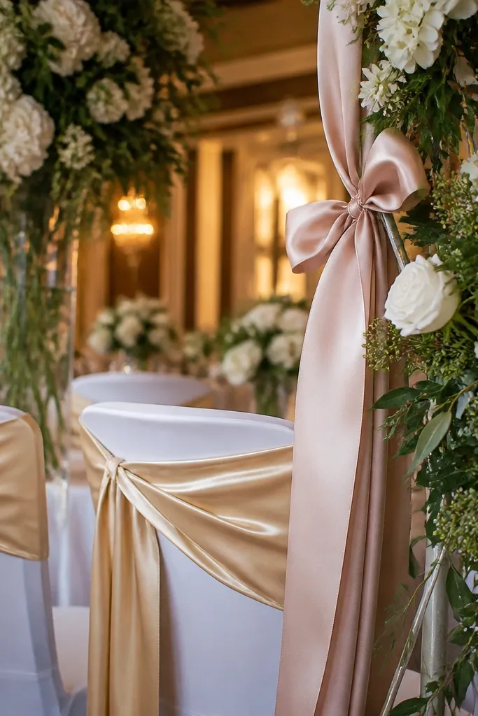
The height of modern restraint. By eliminating color contrast, this palette forces the eye to focus on sculptural form, delicate fabric sheens, and architectural stone textures. Exceptional for year-round urban galleries, historic limestone courtyards, and minimalist luxury hotel penthouses.
Start by placing solid, honed travertine stone slabs as runners directly along the center of tables. Then set out white handcrafted ceramic plates layered with champagne raw-silk ribbon napkins. Finally, group clean glass vessels holding single-variety floral stems—such as white reflexed tulips and ivory sweet peas—down the entire line.
When working with monochromatic whites, you must incorporate at least five distinct textures (linen, silk, stone, ceramic, wax) to avoid a sterile look.
Never mix cool blue-white paper goods with warm alabaster linens; side-by-side color temperature differences make the warm tones look dingy on camera.
11. Espresso Brown, Butter Cream & Copper
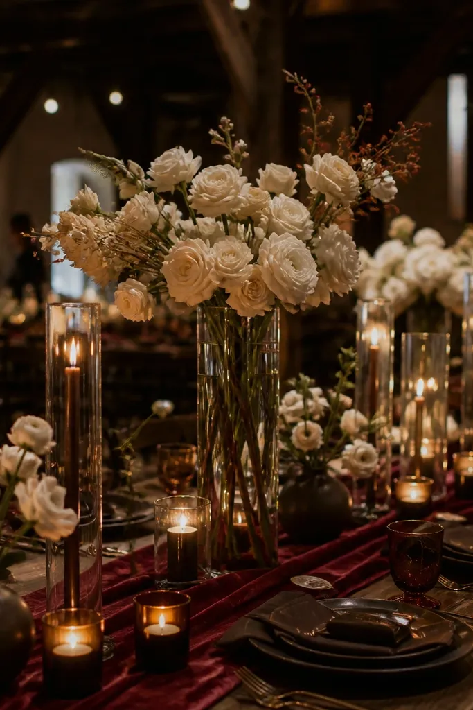
A grounded, decadent palette that feels modern and inviting. Espresso brown creates a rich foundation, butter cream provides soft warmth without the harshness of white, and copper adds reflective metallic sparkle. Best suited for late September through January weddings in brick lofts, industrial warehouses, or converted distilleries.
Start with deep espresso brown washed-linen tablecloths covering wide communal dining tables. Then introduce low glazed earthenware vessels filled with butter-cream garden roses, dried grasses, and espresso carnations. Finally, set out heavy spun-copper chargers and copper-stemmed glassware that catch warm low filament lighting.
Quick tipUse matte butter-cream taper candles rather than bright white ones to keep the flame glow cohesive with warm copper chargers.
Skip thisSkip black chargers; pairing black directly against espresso brown muddies the lines between plates and tablecloths.
12. Desert Rust, Apricot & Bleached Canvas

Warm, modern, and built for bright direct sun. Desert rust anchors the design with terracotta-inspired depth, apricot brings playful sweetness that photographs beautifully in daylight, and bleached canvas keeps the setup feeling airy and architectural. Superb for Joshua Tree, Scottsdale, or Santa Fe weddings from March to May and September to November.
Start with an architectural arch covered in taut, bleached canvas fabric panels. Then anchor the base with asymmetrical mounds of rust-toned banksia, apricot ranunculus, and sun-bleached desert grasses. Finally, set tables with raw terracotta dinnerware, natural linen napkins, and light amber drinking glasses.
Place woven raffia fans on ceremony seats to provide guests with shade while naturally extending the texture palette across the entire seating area.
Avoid pastel baby pink accents; pink clashes with the sun-baked, mineral undertones of desert rust and bleached canvas.
13. Alpine Forest Green, Snow White & Charcoal
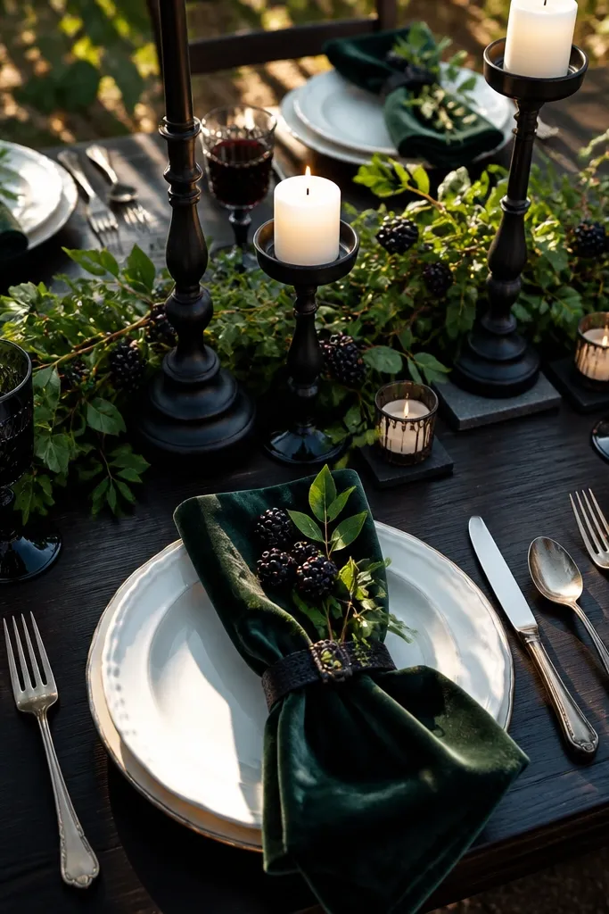
A tailored, high-altitude palette that avoids holiday kitsch. Forest green reflects alpine pine forests, crisp snow white echoes mountain peaks, and charcoal wool adds cozy menswear-inspired tailoring. Perfect for November through March ski resort chalets, mountain lodges, and snowy cabin weddings.
Start with custom charcoal gray wool flannel table runners laid across heavy wood lodge tables. Then lay a dense bough of real pine, cedar, and alpine fir interspersed with snow-white amaryllis and white anemones with black centers. Finally, line the table with tall glass storm lanterns to shield pillar candle flames from mountain drafts.
Quick tipIncorporate wool flannel runners to absorb acoustic bounce in high-ceiling timber lodges while adding physical warmth to the tabletop.
Skip thisAvoid adding bright red berries or plaid tartans unless you are intentionally creating an explicit holiday-themed Christmas party aesthetic.
14. Blanched Almond, Biscuit & Warm Ochre
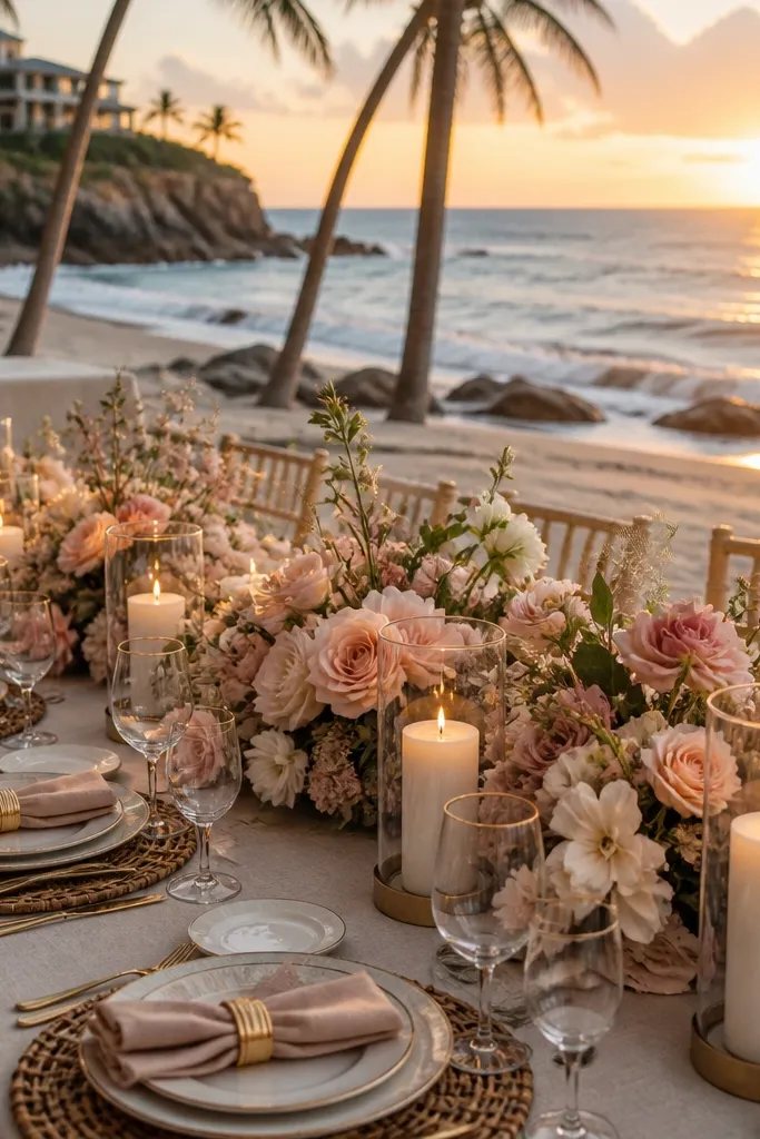
Tone-on-tone perfection designed for natural-light photo studios and art galleries. Blanched almond keeps the backdrop serene, biscuit adds subtle shadow contrast, and warm ochre provides targeted focal points. A year-round modern palette that gives interior daylight spaces a calm, gallery-worthy editorial mood.
Start by hanging a continuous biscuit-toned canvas drop along the primary photo wall. Then dress tables in blanched almond cotton-linen cloths with ribbed ceramic plates and matte ivory cutlery. Finally, introduce warmth down the center using slim ochre-colored beeswax tapers set in low ceramic wells.
Quick tipKeep floral arrangements airy and spaced out with visible negative space between stems so the individual silhouettes register against the wall.
Skip thisSkip busy, multi-colored wildflower centerpieces; this palette demands strict discipline with single-tone dried or fresh architectural botanicals.
15. Dusty Blue, Warm Camel & Walnut Wood
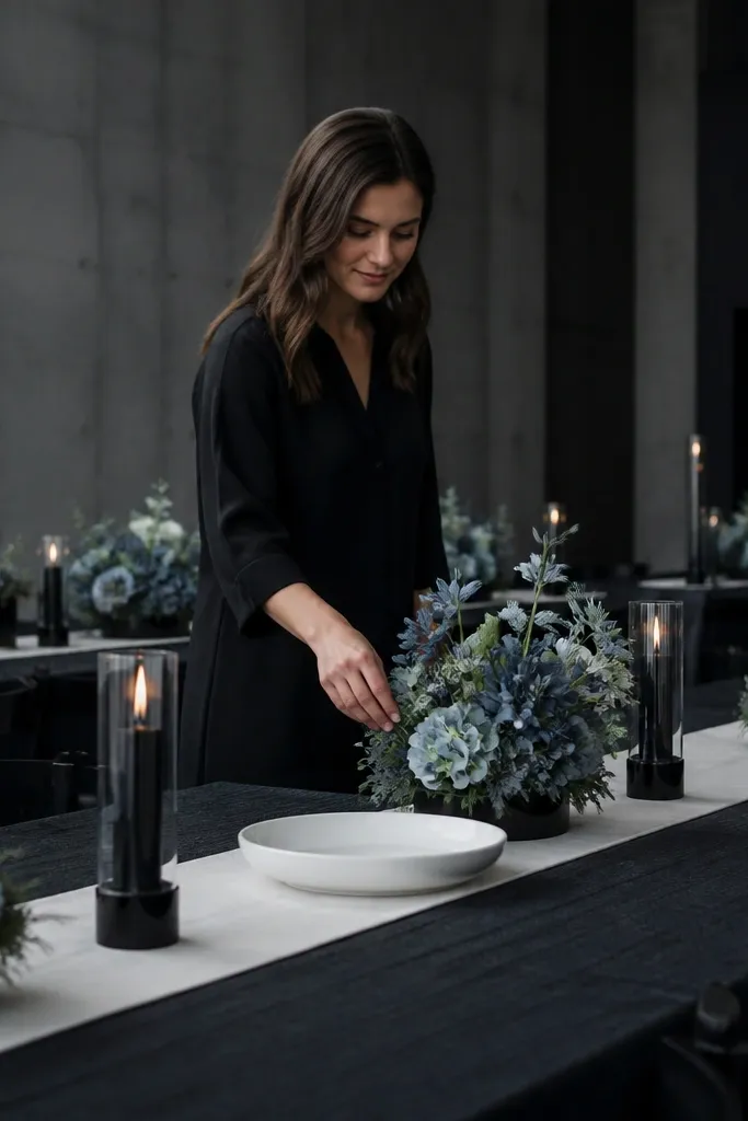
A grown-up, nautical-adjacent palette that trades navy and brass for camel and walnut. Dusty blue introduces ocean breeze coolness, camel leather supplies tailored warmth, and rich walnut wood grounds the entire space. Exceptional for August through October waterfront estates, coastal bluffs, and private sailing clubs.
Start by exposing rich, polished dark walnut dining tables to establish depth. Then position camel leather dining chairs along the sides, paired with sand-colored ceramic dinner plates. Finally, drape dusty blue double-faced satin napkins loosely across each charger, complemented by small clear fluted vases holding white nerine lilies and sea oats.
Use double-faced satin napkins in dusty blue with folded hems; the subtle weight drapes cleanly over guest lap lines for seated dining shots.
Do not add shell decorations or rope accents; the high-end color pairing provides enough coastal storytelling on its own without thematic kitsch.
16. Black Tie Ink, Chalk White & Mirrored Chrome
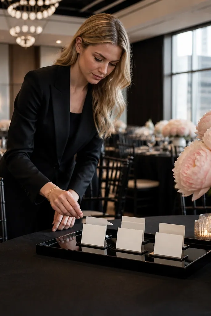
The ultimate high-fashion urban palette. Ink black creates razor-sharp graphic lines, chalk white delivers crisp illumination, and mirrored chrome introduces sleek contemporary reflection. Flawless for year-round evening weddings in modern art museums, rooftop lofts, and urban penthouses.
Start by renting high-gloss black lacquer dining tables that mirror the ceiling architecture. Then place tall, sculptural calla lily arrangements submerged in clear cylindrical glass vessels down the center. Finally, flank each floral tower with mirrored chrome multi-arm candelabras holding tapered chalk-white candles.
Quick tipRequest non-beveled, straight-edge mirrored bases under your chrome candelabras to keep the lines clean, modern, and architectural.
Skip thisAvoid adding rustic wooden elements or woven chargers; they shatter the sleek, high-gloss metropolitan aesthetic instantly.
17. Deep Burgundy, Pale Sage & Antique Pewter
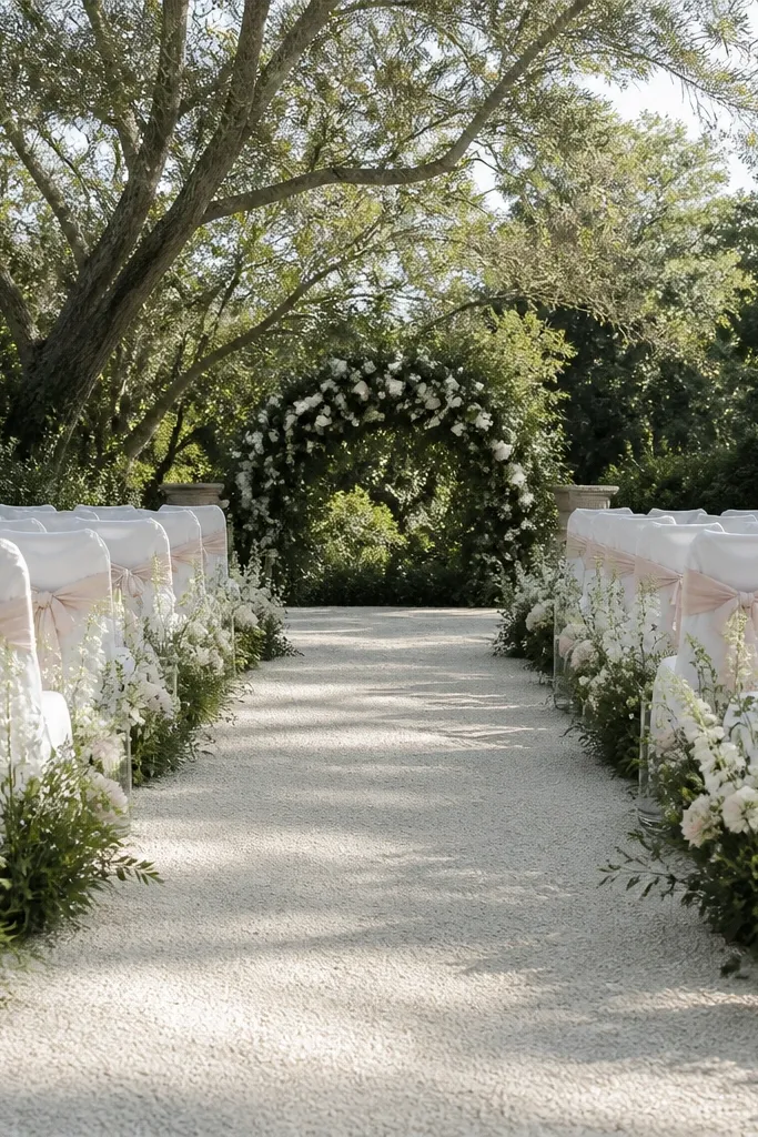
Timeless heritage styling at its most evocative. Deep burgundy supplies dramatic regal depth, pale sage softens the transitions with botanical greenery, and antique pewter grounds the tables with old-world aristocracy. Exceptional from September through December in brick manors, stone castles, and ivy-covered estate courtyards.
Start by laying a pale sage linen cloth over round guest tables to keep the room light and breathable. Then place large antique pewter compotes in the center overflowing with burgundy garden roses, black baccara roses, and trailing sage foliage. Finally, set out vintage pewter water goblets and dark charcoal taper candles in mismatched pewter holders.
Quick tipTie guest menus with custom 1.5-inch frayed-edge burgundy velvet ribbon for an instant tactile upgrade when guests sit down.
Skip thisAvoid bright, cherry-red blooms; the red tones must remain strictly in the wine, plum, and deep burgundy spectrum to preserve the heritage mood.
18. Golden Marigold, Terracotta & Natural Jute
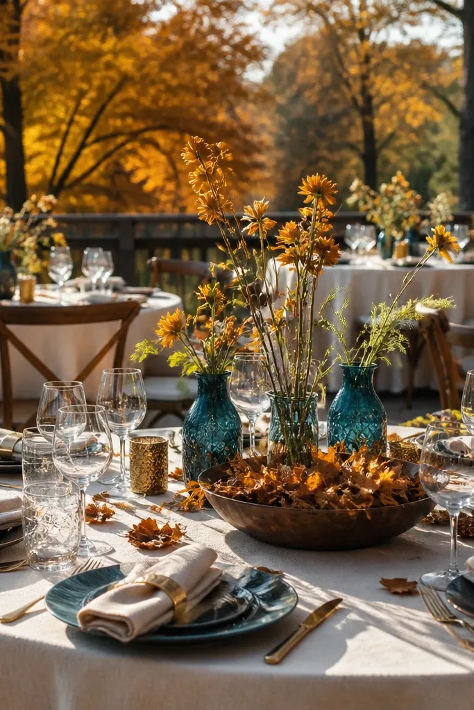
Radiant, joyful, and tailor-made for outdoor celebrations that run directly into golden hour. Golden marigold radiates sunlight, terracotta anchors the plates with earthy substance, and natural jute delivers casual countryside texture. Best suited for July through October farm, orchard, and private ranch celebrations.
Start by rolling natural jute runners down raw wooden trestle tables. Then pack low terracotta troughs with densely clustered marigolds, golden poppies, and dried chamomile flowers. Finally, suspend varied-size rattan lanterns overhead fitted with warm 2200K amber filament bulbs to extend the golden-hour glow into midnight.
Quick tipSuspend oversized open-weave rattan lantern shades over the dining tables; they cast beautiful dappled shadow patterns across the linens as the sun dips low.
Skip thisDo not pair marigold with cool purples or blues unless you want an intense festival look; stick to warm neutrals to keep it elegant.
19. Seafoam Mist, Driftwood Gray & Warm Sand
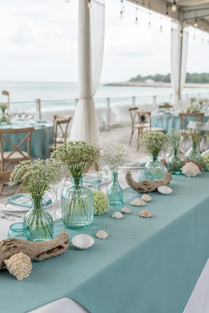
Quiet coastal minimalism that mirrors the shore without clichés. Seafoam mist catches ocean light without turning green, driftwood gray lends weathered wood maturity, and warm sand grounds the base. Created for destination beach weddings from May through September in Malibu, the Hamptons, or the Caribbean.
Start by dressing tables with warm, sand-colored heavy cotton tablecloths. Then run weathered gray driftwood branches along the center, weaving in small clusters of white orchids and seafoam succulent rosettes. Finally, scatter hand-blown seafoam glass tea light holders across the tables to reflect the moving tide outside.
Quick tipUse hand-blown seafoam glass votives with uneven surfaces; they create ripple-like water reflections across the tables when candles are lit.
Skip thisAvoid bright turquoise textiles or dyed blue coral centerpieces; let natural sand and soft seafoam mimic the environment organically.
20. Mulberry, Soft Peach & Brushed Yellow Gold
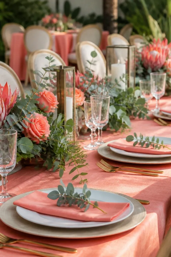
An exquisite transition palette bridging late summer heat and early autumn chill. Deep mulberry supplies moody weight, soft peach keeps the look fresh and luminous in afternoon sun, and brushed yellow gold echoes the changing orchard foliage. Perfect for August and September orchard and farmhouse weddings.
Start with an unlined, natural raw cream linen runner down dark wood tables. Then arrange compotes holding soft peach ranunculus, deep mulberry dahlias, and trailing blackberry bramble in hammered brass footed bowls. Finally, finish with brushed brass chargers topped with soft peach linen napkins and gold-embossed place cards.
Intersperse whole and halved ripe peaches, plums, and blackberries directly among the floral stems for an organic harvest feast design.
Avoid cool, bluish-pinks; the peach tones must carry a warm, yellow-apricot base to pair correctly with mulberry and brass.
21. Slate Blue, Charcoal & White Willow
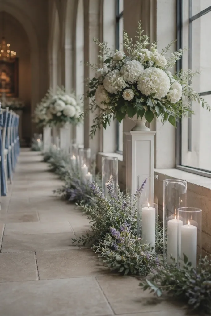
Cool, contemplative, and architectural. Slate blue provides a calm sky-like base, charcoal grounds the table architecture, and white willow branches introduce towering vertical height without blocking guest eye lines across the table. Ideal for April through November weddings in botanical conservatories, converted mills, or urban glasshouses.
Start by dressing banquet tables in full-length slate blue linen with a muted gray cast. Then position towering charcoal metal urns down the center displaying arching white willow branches and white cherry blossom sprays. Finally, set matte charcoal stoneware plates flanked by modern black flatware and smoked-glass water goblets.
Quick tipKeep tall arrangements narrow at the table base and blooming only above 14 inches so guests can converse freely across the slate blue linens.
Skip thisSkip warm yellow or orange accent flowers; warm citrus tones fight the serene, cool-spectrum atmosphere of slate blue and charcoal.
22. Tailored Camel, Cream Silk & Cast Bronze
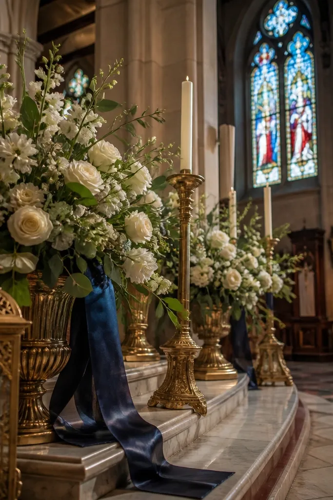
Sleek, masculine, and deeply luxurious. Camel provides an executive neutral foundation, cream silk elevates the light reflectance on guest faces, and cast bronze adds heavy sculptural weight. A timeless choice for city art museums, private architectural residences, and contemporary gallery spaces year-round.
Start with tailored camel twill tablecloths dropped cleanly to the floor. Then fold cream silk napkins into crisp geometric rectangles over heavy cream stoneware dinner plates. Finally, line the table with cast-bronze sculptural candleholders holding tall ivory beeswax taper candles.
Quick tipUse tailored camel fabric with a structured diagonal twill weave; it hangs with clean architectural drape that mimics tailored menswear.
Skip thisAvoid introducing gold glitter or metallic foil; cast bronze and camel derive their prestige from matte, weighty substance rather than high sparkle.
23. Pale Pistachio, Milk Glass White & Blossom Pink
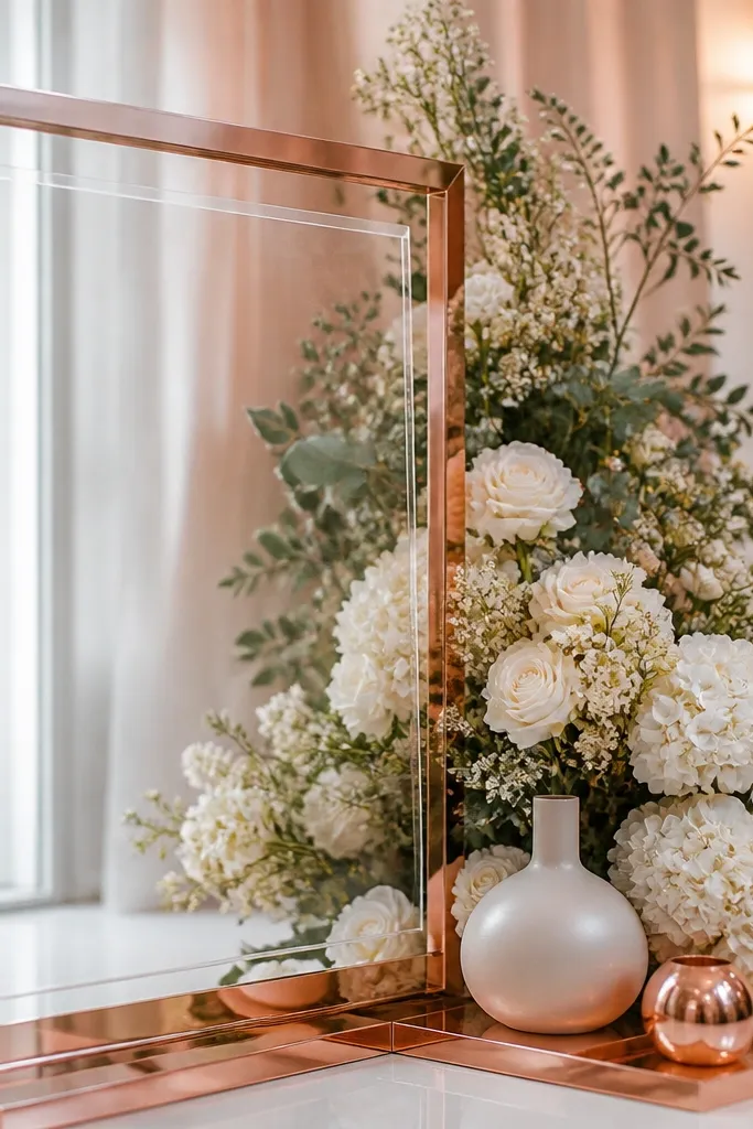
Fresh, cheerful, and restorative. Pale pistachio delivers an unexpected pastel green ground, milk glass white keeps the design soft and vintage, while blossom pink introduces sweet botanical contrast. Best suited for April, May, and early June courtyard weddings, garden teas, and conservatory ceremonies.
Start with smooth pale pistachio cotton tablecloths draped over round courtyard tables. Then group clusters of vintage white milk glass vases containing soft blossom-pink peonies, white sweet peas, and pale lilac sprigs. Finally, set the tables with frosted crystal glassware and delicate blossom-pink calligraphed place cards.
Quick tipCollect vintage milk glass vases in varied fluted and hobnail patterns; their milky opacity softens bright morning and afternoon sun glare.
Skip thisAvoid deep magenta or hot pink florals; vibrant fuchsias will overpower the soft, delicate green of pale pistachio.
24. Ripe Blackberry, Deep Teal & Matte Gold
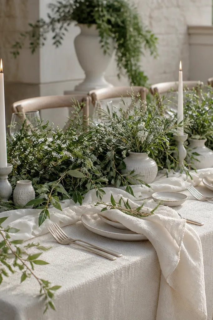
Unapologetically opulent and saturated. Deep teal offers an alluring alternative to navy, ripe blackberry brings velvety dark drama, and matte gold introduces royal warmth that illuminates deep shadow tones. Outstanding for October through February evening celebrations in historic theaters, stone cellars, and moody speakeasy lounges.
Start with heavy, deep teal velvet table linens cascading onto the venue floor. Then design lush, flowing centerpiece displays featuring deep purple calla lilies, dark baccara roses, and cascading blackberry branches in matte gold vessels. Finally, position dark teal taper candles in assorted burnished metal holders down the tables.
Quick tipUse matte gold compotes rather than shiny gold plate so the camera records rich golden texture rather than stark flashlight blowouts.
Skip thisDo not add light pastel pink or pastel blue into this mix; delicate pastels look like accidental mistakes when set against saturated jewel tones.
25. Muted Mustard, Dusty Cedar & Warm Limestone
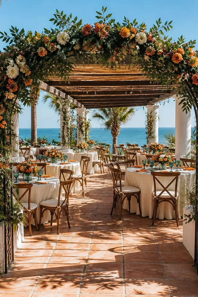
An earthy, sun-baked European feast palette. Muted mustard mimics dried summer fields, dusty cedar wood provides deep rustic warmth, and limestone introduces cool, tactile mineral structure. Excellent for late August through October Mediterranean villa gardens, olive groves, and hillside pergolas.
Start by laying a muted mustard linen runner loosely down long cedar dining tables. Then cluster hand-chiseled limestone blocks holding menus and calligraphed table markers among terracotta vessels of olive foliage and rust carnations. Finally, string low-voltage Edison bulbs overhead along the pergola beams to cast warm shadows over the limestone and cedar.
Use real blocks of hand-chiseled limestone as table number bases and menu card anchors to prevent outdoor breezes from blowing stationery away.
Skip bright yellow citrus or lemon slice decor; the mustard shade must remain muted, ochre-tinted, and dry to look sophisticated and grounded.